If you want people to visit your website, it’s a good idea to pay for some advertising. The trouble is, you need a goal beyond “visiting my website” for that traffic. You can get people on your pages through a thousand different channels, but the ones you pay for need to be special. Otherwise you’re just wasting money.
Landing pages are the true destination for paid advertising. I’m not going to bury the lede here; there’s only one option. Directing paid advertising to your homepage is a foolish move.
Think about it. What’s the difference between a landing page and your homepage?
A homepage is a hub. It’s a central pillar for your site, from which a user can reach other parts of your site. Depending on the kind of site you run, this can operate differently.
- A news-style site will have a homepage that is constantly changing, sometimes as often as every few minutes, with new content. A page like the New York Times always has fresh content on the homepage, every time you visit.
- An industry blog with secondary services will have a homepage like SEO Roundtable’s. It has updated content, though it doesn’t necessarily publish content every single day. Elements like services the site sells are placed on secondary pages through navigation links.
- A business with a secondary blog might have a page like this as a homepage. It’s sort of a landing page, relatively static, primarily aimed at selling a service. And yet it’s not fully targeted, it’s general use, so it’s hard to make narrow paid ads match the content.
- A full commerce site like industry giant Amazon has a homepage with a wide range of targeted recommendations. When was the last time you visited Amazon’s homepage rather than a page for a specific product?
Running paid ads to a homepage is typically not a great idea. The main reason, if you dig into various PPC networks, is something like Google’s quality score.
One of the core elements that makes PPC advertising work is the congruence between the ad copy and the destination. A good paid ad is targeting a narrow audience with narrow messaging, and that audience expects that same level of narrow messaging from the page they find at the other end.
Imagine if you clicked on an ad for a pair of shoes you like, saying they were 10% off. When you open up the link, you end up on the main homepage for Nike. Now what? You have to go digging to find that paid of shoes, hope it’s still in stock and that the deal is still active, and you might not even care anymore. You lost the convenience of a simple click-and-buy, and consequently, it’s just as likely that the store lost a sale.
Guiding the User
The point of paid advertising is to capture a certain segment of your user base and push them deeper in your sales funnel. Typically, you can divide up your audience into five broad groups.
- Cold. These are the people who don’t know much of anything about anything. They aren’t aware that they have a problem, they aren’t aware of your brand or your products, and they don’t really care. Some of these people can be made aware of the problem they face, with ads that lead to specific pieces of relevant content.
- Problem-aware. These are the people who moved on from the first step. They know they have a problem, and they’re starting to look into it. They have no idea who you are, though, and they have no idea what the potential solutions to their problem might be. You can reach these people with ads that have copy and landing pages targeted to the specific problem they face.
- Solution-aware. These are the people from the previous step who are aware that there’s a solution to their problem. They might not know who provides that solution, but they know what to look for in general. This is where you try to capture them with ads with your value proposition; we can solve your problem for you, with X benefit, for Y cost.
- Purchase-ready. These are the people who have experienced your third-tier marketing and have looked around, and decided that your solution to their problem is probably the best one on offer. You can capture them by spreading specific deals in your advertising, and with landing pages that lead immediately into a store page.
Among these, the only one that might possibly benefit from seeing your homepage is the first group, and even then, you can create a more targeted page specifically for different audience sub-groups – rich vs poor, educated vs non, employed vs not, and so on – to better cater your messaging to them.
It’s all about user intent, and capturing that intent with your landing page. Your homepage isn’t well suited to capturing any single specific, narrow niche of people. You may be able to entice some users in general, but it’s not as likely as a landing page.
Think back to Amazon. Their homepage may be “generic” but it’s actually packed full of extremely personal recommendations. They know what you’ve bought and what you’ve looked at, and they can recommend products you may be interested in. Even though the format is broad-spectrum, with hundreds of products on offer, all of those product choices are personalized to the visitor. What I see on my homepage is not what you’ll see, guaranteed.
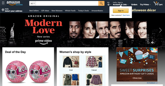
Imagine if you were searching for a specific pair of shoes you like. You see an ad for Amazon, and it takes you to the Amazon front page. However, you’ve never visited Amazon before. They don’t have any recommendations for you, personalized and ready. So there’s a scattershot on the page. Maybe there’s a pair of earrings, maybe some fishing lures, maybe a new TV, maybe a car stereo, maybe a vacuum, maybe a romance novel. All of these things cover various interests, and maybe you’re interested in a bunch of them, but none of them match your intent when you clicked on the ad.
Would you proceed to search for your intended pair of shoes, or would you back out and look for a different store that’s actually promoting what you’re looking for? I know I’d do the latter.
Variation, Intent, and Conversion
Paid advertising has one goal: to get the user who sees the ad to click on it. Depending on the ads, you may have different goals within that goal. Maybe you want to educate the reader on your products, or maybe you know the reader is already educated and you want to convince them to buy.
The key to success with paid advertising, then, is to match content with intent. You do this through variation.
I don’t just mean split-testing here. A/B testing is a powerful tool, but it’s only useful for audiences where you’ve already matched your copy with the audience intent. It’s for second-stage optimization, where we’re talking about first-stage optimization.
Think of the audience divisions up above. Could you design one single ad that is compelling to people in all four stages of awareness? Could you write ad copy so good that people who have never heard of your company and people who are intimately aware of your products both click it?
Maybe you could, but let me tell you, it won’t be as effective. It will cost more and reach fewer people than if you divided up each of the four stages into their own targeted advertising.
Here’s another scenario. You work a 9-5 job, but you’re getting tired of it and you’re getting stressed about it. So you start searching for ways to relieve stress from working all the time.
You’re presented with varying levels of solution to this problem. Some ads recommend stress balls, and some recommend yoga, and some recommend a vacation. At this point, you get to think about which of those options fits your needs most closely. Only one of them is likely to be the true solution, and that company “wins” your awareness.
Maybe you decide you want to try some yoga. Now you’re researching yoga, from DIY video tutorials to in-house trainers to weekly yoga meetings. Again, you’re faced with a choice. The company that attracted you to yoga in the first place won’t reach you with the same ad again; rather, they need to have another ad that targets you now.

Maybe you pick a weekly yoga meeting hosted by that company. You’re interested, so you need to research it some more. Ads, at this point, are either going to try to pull you away from that company, or are going to convince you to purchase the accessories you need for yoga, the membership to the club, or whatever else you need to be successful.
One ad doesn’t fit all of these scenarios. Neither focuses on a single destination. If you have no idea how yoga can help with workplace stress, a homepage isn’t going to help; you want a landing page that is packed full of content about the stress-reduction benefits of yoga. You’re not ready to buy anything, so a page that focuses on selling you a membership isn’t going to go over well.
Later, when you’re aware of the benefits of yoga and you’re looking to buy, a homepage isn’t going to be all that helpful. You want a landing page that tells you what kinds of products you need and what packages are on offer, so you can choose what you want to buy.
Minimizing Distraction
One of the core principles of landing page design is to minimize user choice. The more options a user has, the more likely the option they’re going to choose is to leave. People don’t like having to confront complicated scenarios. They don’t like having to problem solve in the middle of their problem solving. They simply want to be presented with a solution. Decision paralysis is a large part of this issue.
Look at your homepage. What’s going on? You have links to service pages, links to blog posts, links to a contact page, links to social media. What is the user going to do?
The point of a homepage is to give a user those options. The user knows your brand, they know your service, and you’re giving them a hub they can use to dig deeper into anything related to you. Maybe they want to read more of your blog content, so you have a blog link for them. Maybe they want to read more about a specific product, so they click a link to your product page. Maybe they want to read your company history, so they click the About link.

A landing page knows what the user is coming there to see, and focuses itself solely around that destination. The product page, the about page, the blog post; these could be considered landing pages, if not for the trappings of a normal website around them.
There’s very little reason to pay to bring people to your homepage. You should always be more focused than that. Know who you’re trying to reach, know what they’re trying to find, and provide that exact content for them in the form of a landing page. To do anything less could end up wasting your valuable ad dollars.
The post Landing Page vs Homepage: Which One Should You Promote? appeared first on Growtraffic Blog.
Source: Grow Traffic News feed
